can we help you?
+1 855 753 5474
added to sample request
you've reached the maximum of 50 samples
can we help you?
+1 855 753 5474
Both nearing their 50th anniversaries, Vescom and Shannon were born together and raised together. ‘When some people think of Vescom, they immediately think of Shannon,’ says Vescom CEO Philippe van Esch. ‘Shannon’s pattern – unique, recognizable, outspoken, with a strong focus on structure and materiality – is connected to the identity of Vescom itself.
Just as the company has evolved over the years while remaining true to its core, so, too, has Shannon. That’s why we can reintroduce this pattern again and again and it will still feel contemporary. Design-driven rather than decorative, it’s a statement that can fit in anywhere. It doesn’t overpower an interior but supports it. Like all Vescom materials, it doesn’t tell the story; it’s part of the story.’
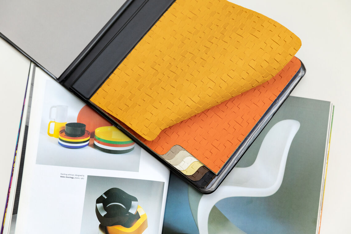
The first Shannon series was released almost 50 years ago. It was the early 1970s and plastic was synonymous with positivity. Plastic fantastic! From shape to colour, everything was possible. The world was struck by the benefits of the material: long lasting, lightweight, waterproof, inexpensive and easy to mass produce. In turn, design became more democratic and affordable for everyone. Shannon’s colours were the colours of the period. This orange, that brown, this yellow – they could be seen everywhere and on everything from clothing to furniture to home accessories.
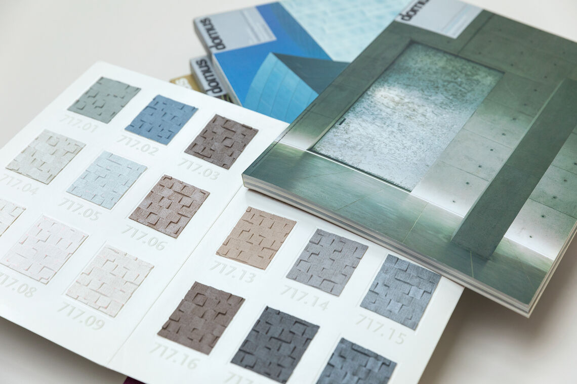
The mid- to late-1990s saw the arrival of such modernist architectural icons as Frank Gehry’s Guggenheim Museum in Bilbao. Designers began to look at materials in completely new ways. How could they manipulate materials to build differently, to generate novel shapes? In response, Shannon’s colour card became an almost non-colour card. It drew from architectural materials like metals and concrete, turning the light-and-shadow play on Shannon’s textured surface into the star of the show.
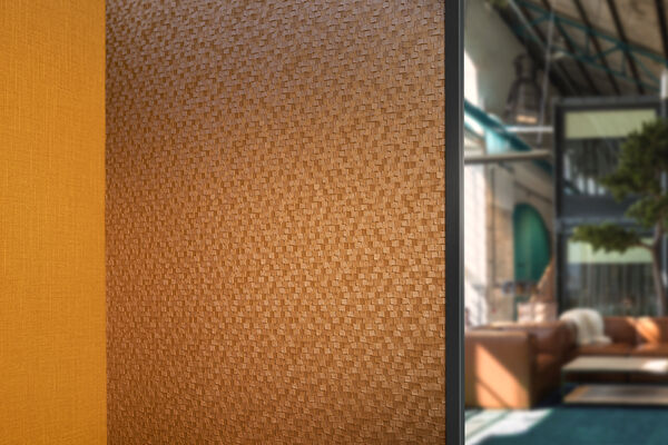
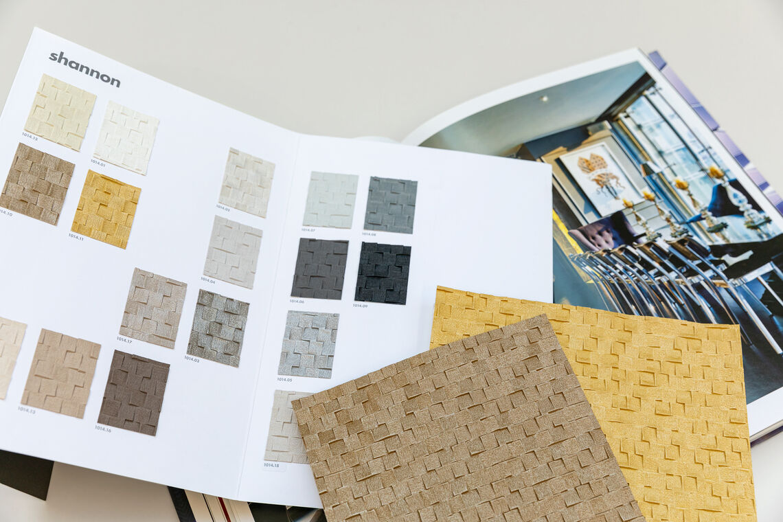
With the advent of the 21st century came a return to opulence. But this was a new type of luxury – chic and less ostentatious. Interiors were in the foreground, refocusing our increasing material sensitivity towards softer, richer materials for the indoors. These themes were combined in new interior concepts: think of Philippe Starck’s string of hotels, for instance, places not only for sleeping but for entertainment as well. Echoing these wider shifts in the design world, Shannon evolved as well. Its palette included colours associated with indulgence – gold, silver, bronze, onyx – while simultaneously becoming more nuanced, subtle and refined.
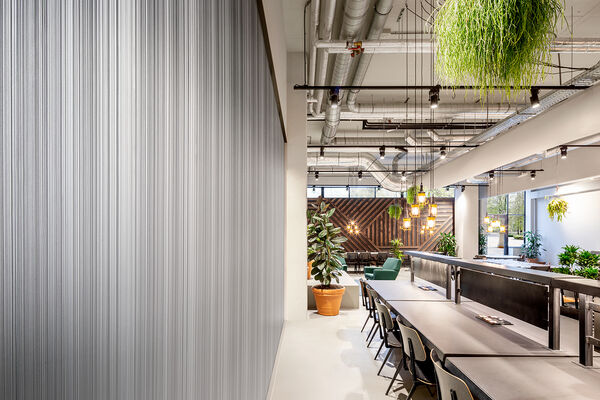
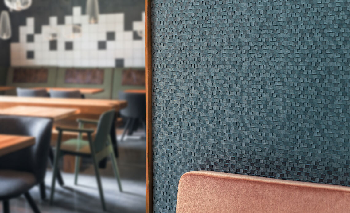
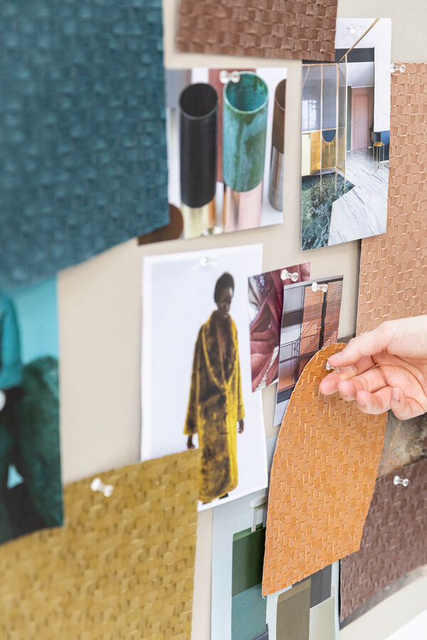
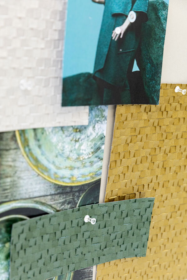
Shannon’s 2021 palette reflects the diversity of today’s interiors. Expressive and varied, it’s a wallcovering that can become an accent in any interior – rich or reduced – producing limitless atmospheres and identities.
Over the years, Shannon has become even more about materiality – a full expression of the beauty of vinyl’s possibilities. Shannon is a chameleon of sorts. Its updated palette includes numerous matte neutrals that refer to crushed paper or structured ceramics. Other tones are inspired by everything from precious jewels to mosaic tiles to stone. Some colours feel extracted from gemstones: emerald green, lapis lazuli blue, golden amber and rose quartz. Others could be mined from the Earth’s strata: anthracite black, granite grey, clay brown and burnished copper.
Although it retains the undeniable spatial qualities of its predecessors, Shannon feels more intimate than ever before, as if it’s closing the distance between the body and its surroundings.
Philippe van Esch, CEO Vescom